
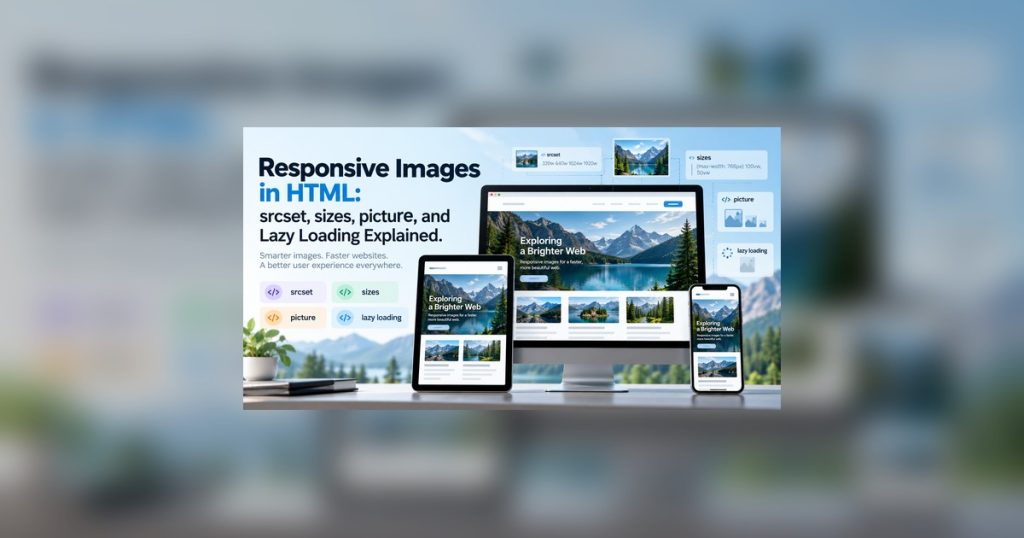
Responsive images in HTML help browsers deliver an appropriately sized image for each screen and layout, reducing unnecessary downloads without sacrificing clarity.
Learn how responsive images in HTML work in modern browsers. This practical guide explains srcset, sizes, the <picture> element, image dimensions, lazy loading, and common mistakes with real code examples.

Suggested visual: one source image branching into 480px, 800px, and 1200px versions for phone, tablet, and desktop.
What Are Responsive Images?
A responsive image implementation adapts the image resource delivered to the browser based on factors such as the expected display size and the characteristics of the user’s screen.
There are two common problems responsive images are designed to solve:
- Resolution switching — serving the same image at different resolutions.
- Art direction — serving a different crop or composition for different layouts.
The Basic <img> Element
A traditional image might look like this:
<img
  src="/images/mountain-1200.jpg"
  alt="Snow-covered mountains at sunrise"
>
This works, but every visitor receives the same image resource. If the file is much larger than the rendered image, mobile users may download more data than necessary.
Using srcset for Responsive Images in HTML
The srcset attribute provides a list of image candidates:
<img
  src="/images/mountain-1200.jpg"
  srcset="/images/mountain-480.jpg 480w, /images/mountain-800.jpg 800w, /images/mountain-1200.jpg 1200w"
  alt="Snow-covered mountains at sunrise"
>
The numbers followed by w describe the intrinsic widths of the available files. The browser can use those candidates when choosing a resource.



Suggested visual: 480w → mobile, 800w → tablet, 1200w → desktop.
Understanding the sizes Attribute
The browser also needs information about how large the image is expected to appear in the layout.
<img
  src="/images/mountain-1200.jpg"
  srcset="/images/mountain-480.jpg 480w, /images/mountain-800.jpg 800w, /images/mountain-1200.jpg 1200w"
  sizes="
    (max-width: 600px) 100vw,
    50vw
  "
  alt="Snow-covered mountains at sunrise"
>
(max-width: 600px) 100vw
On smaller screens, the image is expected to occupy approximately the full viewport width.
50vw
Otherwise, the image is expected to occupy roughly half of the viewport width.
A More Realistic Responsive Image
A common article layout might display an image full width on a phone but cap it around 700 pixels on larger screens:
<img
  src="/images/workspace-1200.jpg"
  srcset="/images/workspace-480.jpg 480w, /images/workspace-768.jpg 768w, /images/workspace-1200.jpg 1200w"
  sizes="
    (max-width: 700px) 100vw,
    700px
  "
  width="1200"
  height="800"
  alt="Developer workspace with a laptop and external monitor"
>
img {
max-width: 100%;
height: auto;
}
Desktop crop — developer-desktop.jpg

Mobile crop — developer-mobile.jpg
When to Use <picture>
srcset is ideal when the composition stays the same and only the resolution changes. Sometimes the actual crop needs to change. That is called art direction.
<picture>
  <source
    media="(max-width: 600px)"
    srcset="/images/developer-mobile.jpg"
  >

  <source
    media="(min-width: 601px)"
    srcset="/images/developer-desktop.jpg"
  >

  <img
    src="/images/developer-desktop.jpg"
    width="1400"
    height="800"
    alt="Developer working at a desk"
  >
</picture>
Using <picture> for Responsive Images in HTML
The <picture> element can also provide different file formats while keeping a conventional fallback image.
<picture>
  <source
    srcset="/images/hero.avif"
    type="image/avif"
  >

  <source
    srcset="/images/hero.webp"
    type="image/webp"
  >

  <img
    src="/images/hero.jpg"
    width="1200"
    height="700"
    alt="Laptop displaying a web development project"
  >
</picture>
AVIF
A modern image option that can be offered as the first source candidate.

WebP
Another modern format that can be supplied as an alternative source.

JPEG fallback
The normal <img> source provides a conventional fallback.
Responsive Formats and Responsive Sizes Can Work Together
You can give the browser choices for both file format and resolution:
<picture>
  <source
    type="image/avif"
    srcset="/images/project-480.avif 480w, /images/project-800.avif 800w, /images/project-1200.avif 1200w"
    sizes="(max-width: 700px) 100vw, 700px"
  >

  <source
    type="image/webp"
    srcset="/images/project-480.webp 480w, /images/project-800.webp 800w, /images/project-1200.webp 1200w"
    sizes="(max-width: 700px) 100vw, 700px"
  >

  <img
    src="/images/project-1200.jpg"
    srcset="/images/project-480.jpg 480w, /images/project-800.jpg 800w, /images/project-1200.jpg 1200w"
    sizes="(max-width: 700px) 100vw, 700px"
    width="1200"
    height="800"
    alt="Web application displayed on a laptop"
  >
</picture>Native Lazy Loading
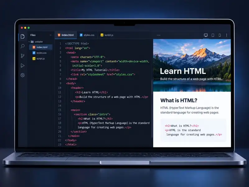
Images farther down a page often do not need to load immediately. Modern HTML provides native image lazy loading with loading="lazy".
<img
  src="/images/tutorial-800.jpg"
  loading="lazy"
  width="800"
  height="500"
  alt="Code editor showing an HTML tutorial"
>
Suggested visual: visible images loaded first while images farther below the viewport wait until the user scrolls.
Always Write Useful Alternative Text
Responsive image performance does not replace accessibility. Meaningful images should include alternative text that communicates the useful information in the image.
<img
  src="/images/dashboard.jpg"
  alt="Analytics dashboard showing traffic increasing over seven days"
>
For a purely decorative image, an empty alt value can be appropriate:
<img
  src="/images/decorative-divider.svg"
  alt=""
>
Suggested visual: poor alt text examples compared with a concise, descriptive alternative.
Common Responsive Image Mistakes
Mistake #1: Using srcset Without Thinking About Layout
When width descriptors are used, give the browser a useful sizes value that reflects the real layout.
sizes="(max-width: 760px) 100vw, 760px"Mistake #2: Creating Too Many Image Variants
You usually do not need an image at every possible width. Choose useful breakpoints based on real layouts.
480px
768px
1200px
1600px
Mistake #3: Forgetting width and height
Intrinsic dimensions can coexist with responsive CSS.
width="1200"
height="800"
img {
width: 100%;
height: auto;
}Mistake #4: Building the Whole System in JavaScript
Responsive source selection is already a browser feature. Native responsive-image markup lets the browser make the decision earlier in the loading process.
A Practical Production Pattern
For a normal article image, a strong starting point looks like this:
<img
  src="/images/responsive-images-1200.webp"
  srcset="/images/responsive-images-480.webp 480w, /images/responsive-images-768.webp 768w, /images/responsive-images-1200.webp 1200w"
  sizes="
    (max-width: 768px) 100vw,
    760px
  "
  width="1200"
  height="800"
  loading="lazy"
  alt="Responsive web design displayed across desktop, tablet, and mobile screens"
>
In production, responsive images in HTML are easiest to maintain when resolution switching, art direction, modern formats, intrinsic dimensions, and loading behavior are treated as one coordinated system.
Responsive Image Checklist
- ✓ Does the image have useful alternative text?
- ✓ Are multiple resolutions available where useful?
- ✓ Does
sizesmatch the actual layout? - ✓ Are
widthandheightsupplied? - ✓ Are below-the-fold images lazy loaded?
- ✓ Are important above-the-fold images allowed to load promptly?
- ✓ Does the mobile layout need a different crop?
- ✓ Would
<picture>improve art direction? - ✓ Are small screens receiving unnecessarily huge images?

Suggested visual: HTML → srcset → sizes → picture → faster responsive images.
Final Thoughts
Responsive images can look complicated at first because several HTML attributes work together. The underlying idea is simple:
Give the browser good choices and enough information to choose among them.
Use srcset when you have multiple resolutions of the same image. Use sizes to describe approximately how wide the image will be in your layout. Use <picture> when the actual image source or composition needs to change. Use native lazy loading for images that do not need to load immediately.
And provide intrinsic dimensions and meaningful alternative text as part of the image markup. Once those patterns become familiar, responsive images stop feeling like an advanced optimization and become a normal part of building fast, flexible websites.
Used thoughtfully, responsive images in HTML improve page efficiency across phones, tablets, laptops, and high-density displays while keeping the markup understandable and browser-native.